

Grading the Olympic Mascots

Last night, while intoxicated, I wrote this draft. I have decided to publish it.
The vast majority of the photos on this page come from TheOlympicDesign.com.
The art of the official Olympic mascot is one reaching back decades. In the wake of another Olympic Games, as well as the universal negative reception of the use of generative AI in the creative materials for it, let’s go back and review the creative iconography of Olympics past.
Los Angeles 1932 (unofficial): Smoky/Smokey

A stray dog adopted by athletes at the Olympic Village. While basic (and unofficial), it’s very hard to argue with the authority of a vest like that. Technically the only living Olympic mascot. Survived “a couple of” broken legs throughout the course of the Games, according to the New York Times. Disappeared for a day midway through the Games, garnering press coverage mourning his disappearance, but returned unharmed the next day. Killed by a speeding motorist, April 1934.

Grade: B+. That is, indeed, a dog.
Tokyo 1964 (unofficial): Kapa
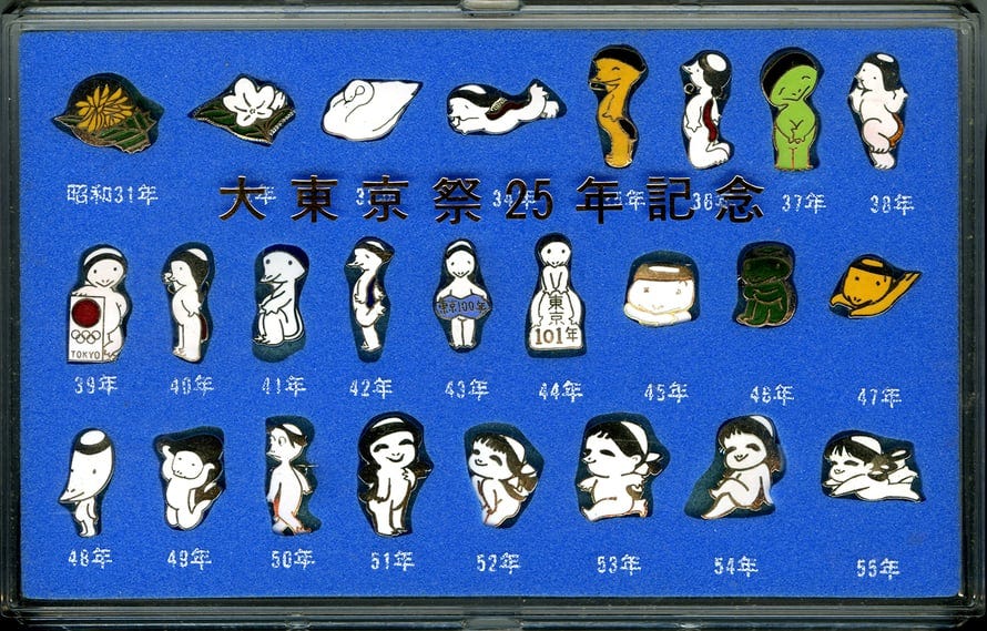
Semi-cutesy interpretation of the river child creature kappa from Japanese folklore. Quite a bit more “unofficial” than even the other unofficial ones, as this pin set is the only example of it - he was an adaptation of the mascot for the annual Tokyo Sport festival, which had been running since 1956. These pins represent 24 years of…something, I’m not actually clear (other than the mascot’s birth), with Showa 39 representing the year 1964. I do like whatever is going on in Showa 48 (what was supposed to happen in 1973??), in any case.
Grade: C-. Big points off for looking nothing like the 19th century woodblock depictions of kappa.

Grenoble 1968 (initially unofficial, later recognized by the IOC): Schuss

Strong points: Phenomenal graphic design. Vibrant, tasteful color usage. Very well-sculpted physical object.
Major drawback: That is a sperm.
Could be worse, I guess.

Ah. Yep, that’ll do it.
Grade: C+. Again: even considering that it is tastefully designed, that is a sperm.
Sapporo 1972 (unofficial): Takuchan

Finally, some good fucking food.
This is a mascot designed by Seiko entirely and openly for the purpose of selling Olympics merchandise, which is more cynical than most of these, but he’s very good, so I will give him a pass. He had unique designs for multiple events:

Grade: A-. Big marketing bear. Can’t complain.
Mexico City 1968 (unofficial): Chac Mool/El Jaguar Rojo de Chichen-Itza

This guy is very hard to find info on. I can’t even find a definitive answer to his name. I suspect he was created solely by marketing firms, for marketing. Artistic interpretation of the ancient Mayan “Red Jaguar Throne” of the city of Chichén Itzá.
Grade: B? There’s so little to go off of here.
Munich 1972: Waldi

Often considered “the first Olympics mascot” since it was the first official one (despite the post hoc recognition of Schuss), holy shit, what a banger. Designed by legendary German graphic designed Otl Aicher, who was also responsible for legendary logos like Braun and Lufthansa, as well as some amazingly good pictograms also for the 1972 Summer Games, Waldi is a very colorful dachshund who represents “the attributes required by Olympic athletes” - agility, resistance, and tenacity. I’m not sure how, but he looks great.
Very heavily merchandised, but that’s fine, because I’d buy this plush.

Grade: A. Hell yeah man, that’s a dog.
Innsbruck 1976: Schneemann

I don’t know what this is, but I don’t like how he’s looking at me.
Grade: C.
Montréal 1976: Amik

So, let me come out and say this right now: The rest of you are so insanely lucky we’re not grading on a curve, because all of you would be left in the dust by Amik. Chosen as both a regional symbol and as a symbol of hard work and resilience, Amik is quite possibly one of the best pieces of graphic design I have ever seen. Depicted either in this multicolor stripe symbolizing that he is gay the Montreal Olympic Organizing Committee or a red sash with the logo of the Games, I simply cannot hype up how simple, striking, effective, and tasteful this design is, both in the two dimensional space and in the three-dimensional space.

Grade: A+ and graduating summa cum laude.
Lake Placid 1980: Roni

Trash panda. I actually quite like this guy, but he’s very poorly documented. Much like Sapporo, they designed versions of him for multiple events.

Grade: A-. Very similar to Takuchan in philosophy, but a lot more American in design.
Moscow 1980: Misha

Another master class in design from the Soviets. What more is there to say? Cute forest creature. There’s a plushie of this guy on Facebook Marketplace near me (presumably from before the western boycott of the Games) that I’ve been tempted by for months (and they’re plentiful on eBay).
Much as before, they did different versions for different events.

He also got imported to Japan for an anime series in 1979.

Grade: A+. Immaculate, iconic, and pleasant.
Sarajevo 1984: Vučko

This guy has been all over Twitter and Bluesky lately and it’s pretty easy to see why. Cool wolf. Basically the opposite of the weird AI imagery in the current Olympics in terms of the whole heart and soul thing.
I really can’t add much more. You look at it and you know it’s good.

Grade: A+. He’s got silly poses.
Los Angeles 1984: Sam

Go fuck yourself.
Weirdly, also made into an anime series in Japan.
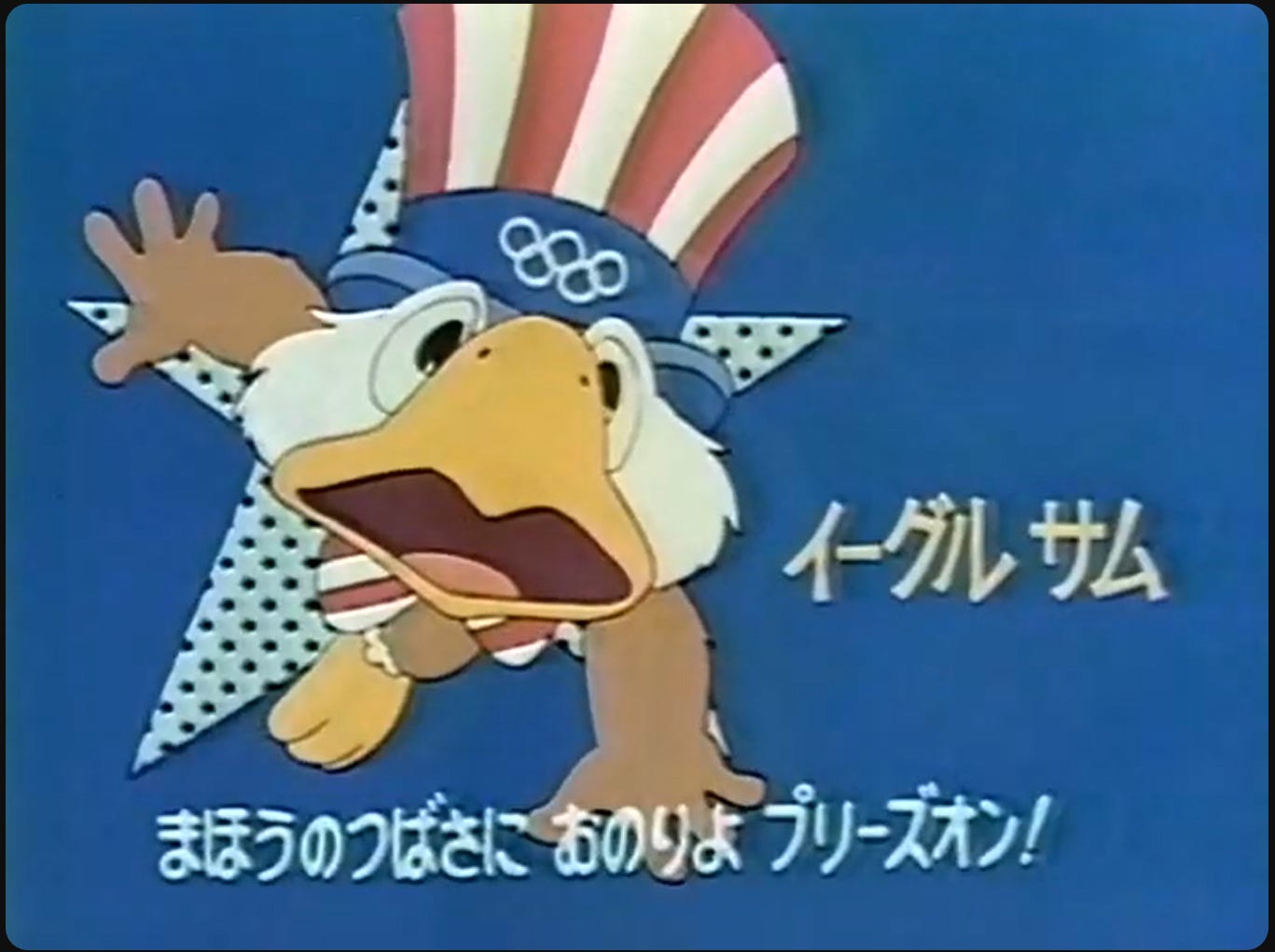
Unlike the Misha anime, the vast majority of it is considered lost. Honestly, that’s probably for the better.
They initially wanted to use a bear mascot to symbolize the state of California, but Misha being used in 1980 made them create this instead.
Grade: D. Exhausted, overdone national symbol designed by a Disney artist to be made into Happy Meal toys.
Calgary 1988: Hidy and Howdy
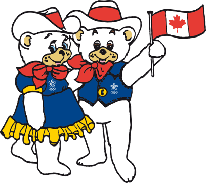
These two are very mid-80s in their styling (think Strawberry Shortcake, that kind of thing), and their country western-style outfits are rather symbolic of Alberta, which is, as always, just a worse Texas, but that’s fine. They’re cute.
It’s worth noting that this does kick off a trend that will become drastically more intense in the coming years, namely having multiple mascots for one Olympics.
Grade: B. Inoffensive, but I like them.
Seoul 1988: Hodori

This guy is very angular with a lot of very bold lines. Pretty good. Originally designed for the 1986 Asian Games and reused here. I don’t have much to say here - the design language just passes the eye test.

Grade: A. I’d hang out with him.
Albertville 1992: Magique

This is definitely very 1992. He’s got a lot of sharp outer linework but messier inner linework. Definitely wants to look like a piece of child’s artwork, but is far too corporate to pull that off.
Grade: B-. I don’t get why they gave him a bulge?
Barcelona 1992: Cobi

Yeah, fuck it, I’d let this guy sell me a car. I don’t have much to say here, he’s perfectly fine. I don’t think he’d translate well to a mascot costume, but I can’t find any evidence they tried, so it’s fine. They did draw him explicitly experiencing a wide variety of emotions, however, which is…actually a first for an Olympic mascot.

Weirdly, the photo of him on Wikipedia features him nude.

Grade: B. Inoffensive and definitely designed by committee, but it’s fine, that’s fine sometimes.
Lillehammer 1994: Kristin & Håkon

I deeply hate the way these two are looking at me. So much so I’m not even gonna dwell.

Grade: C-. That art style doesn’t work here, sorry, this isn’t a PBS Kids show of the same era.
Atlanta 1996: Izzy

Oh, now this is the sort of homegrown, all-natural American slop I was hoping to see in 1984. This was done by a single guy, named John Ryan, who worked at an Atlanta-area computer animation company and did an extensive press tour about his mascot design that nearly everyone hated.
"In art, you’re a failure when you’re ignored."
— John Ryan, 1996
Despite being nearly universally hated, they merchandised the fuck out of this guy. He got physical products, he got a television special, they sent him in to be interviewed by news outlets (including animated appearances on shows like NBC’s TODAY). There are a lot of Americans who will remember him based on merchandise alone.
Squim, a character created for a 2025 episode of the [adult swim] animated series Smiling Friends, was very clearly inspired by him in some ways, which truly just proves we’re all living in Izzy’s world(?).

Grade: B+. On all design fronts, he absolutely sucks, but they genuinely created a memorable design that people talked about for far longer than most other Olympics mascots. Plus, my personal affinity for certain flavors of slop is clearly showing here.
Nagano 1998: Sukki, Nokki, Lekki, and Tsukki/The Snowlets
I don’t know what I can say about these guys. Designed by Landor Associates, who have done far better and more iconic designs, these mascots represent fire, earth, water, and air, and, in another similarity to Avatar: the Last Airbender, I can’t say I get it.
Certainly a hallmark of “corporate art made to look like children's drawings”, though
Grade: C-.
Sydney 2000: Olly, Syd, and Millie
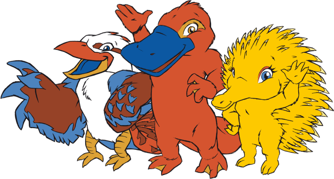
We are firmly in the era of boring corporate mascots now. A kookaburra named Olly (for “Olympics”), a platypus named Syd (for “Sydney”), and an echidna named Millie (for “Millennium”, as was the style of the time).
I honestly have no comment here. These are so insanely boring.
Grade: C-. No sauce here, but they’re passable.
Salt Lake City 2002: Powder, Copper, and Coal

The naked political propaganda of naming the bear “coal” for an Olympics in a red state under a Republican administration obsessed with making the environment worse via coal mining and burning aside, I do actually like these guys.
That’s not to say all Olympic mascots aren’t political in some sense - every component of the Olympics is political, even! - but come on. The bear is named “coal”. Fuck off.
I’m not happy about giving Utah a bear after refusing to give California one in 1984, though.

Grade: D. It’d be a C+ if not for the naked shilling for coal.
Athens 2004: Athena and Phevos

I don’t know what design firm possibly thought this was a good idea.
Grade: F. Why are Athena’s tits like that?
Torino 2006: Neve and Gliz

These are stick figures with a snowball and an ice cube for heads. Somehow, they’ve gendered the snowball and ice cube.
I mean, compared to 2004, it’s refreshing to be back in the land of nothingness, I guess?
Grade: D-.
Beijing 2008: Beibei, Jingjing, Huanhuan, Yingying, and Nini/the Fuwa
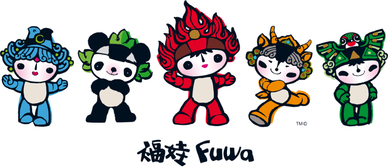
Okay, this is much better. Heavily inspired by various pieces of Chinese culture and literally named after the characters making up the sentence “Beijing welcomes you” (北京欢迎你, “beijing huanying ni”), the Fuwa are an actually good entry in the series of Little Guys you often see nowadays. The number of mascots allowed for each to be used for certain events, which helps in a modern Olympics with dozens of different events. This is a relatively small amount of them, even:

Grade: B+.
Vancouver 2010: Miga and Quatchi
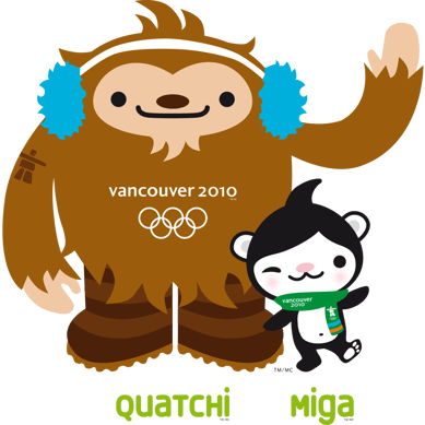
Possibly the main thing I’m observing is how very 2010 these designs are. They do, in fact, look like plushies you’d see on the shelf at Toys’R’Us. What more can I say?
Grade: B. Unremarkable, but I’d be thrilled if I was given a Quatchi plush for free while entering an Olympic event.
London 2012: Wenlock
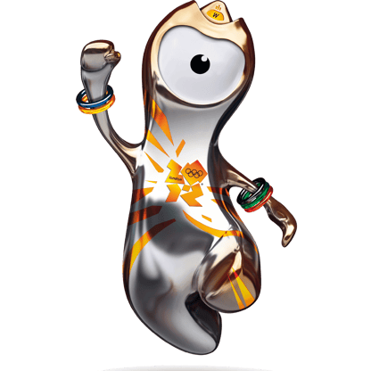
Blorbo (derogatory).
Everyone made fun of this 15 years ago. I am still making fun of it.
Wenlock was designed the same year as the Minions (2010). Personally, I’d prefer if both of them had stayed in 2010.
Grade: C-.
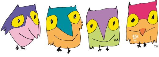
Sochi 2014: Leopard, Hare, and Polar Bear

Polar Bear, in addition to being a political symbol of United Russia (which was then-Prime Minister Putin’s party at the time), is blatantly plagiarized from Misha. Misha’s original artist, Viktor Chizhikov, openly accused them of such.
These mascots were selected by nationwide text message polling, which was later scrutinized as being potentially rigged in favor of Prime Minister Putin’s preferred candidate (Polar Bear).
Grade: zero, referred to the Office of Academic Integrity.
Rio 2016: Vinicius
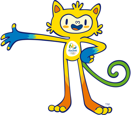
This is just a generic cartoon character of the era. It’s got bean mouth and everything.
Grade: C-.
PyeongChang 2018: Soohorang

Marketable plushie with Korean design characteristics. I quite like the bold, consistent outlines and simple color choices, if I’m being honest, but that does look a bit like a dick on his face.
Grade: B.
Tokyo 2020 2021: Miraitowa

A robot mascot was inevitable, but honestly, it feels like a fresh idea after ~20 years of animal mascots.
That said, the Paralympic mascot (Someity) is, like…ridiculously better than this one.

Grade: A-. First new idea in 20+ years.
Beijing 2022: Bing Dwen Dwen

Weird-Telegram-sticker-pack-core.
Inoffensive, but he could stand to lose a few pounds. Gonna be hard to do from inside of a literal suit of ice, but…well, we all gotta start somewhere.
Grade: B-.
Paris 2024: Phryges

You know, I take back what I said about Wenlock, because this is much more of a Blorbo (Derogatory).
People said it looked like a clitoris, which the French socialist newspaper Libération said was a pleasant change from the traditionally phallic imagery of the Eiffel Tower.
I don’t know anymore.
Grade: D+.
Milano Cortina 2026: Tina
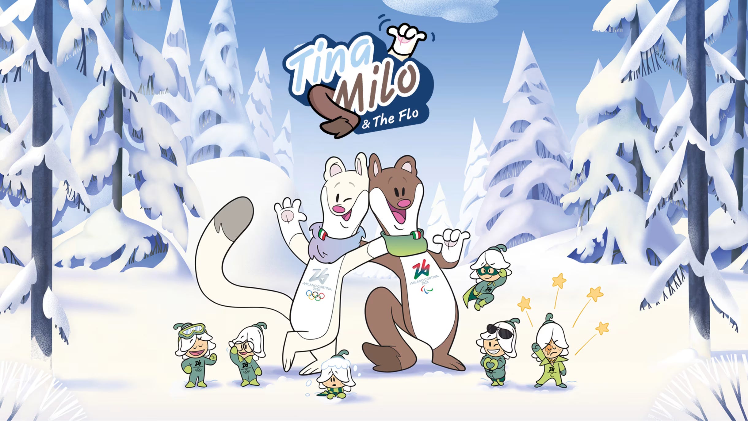
So, actually, one of the main reasons the use of generative AI imagery in the Olympic opening was so shitty was because the Olympic mascots this year were actually unusually good.
These stoats (Tina for the Olympics and Milo for the Paralympics) have, after nearly 25 years of corporate slop with very few exceptions, some of the most genuine-feeling spirit I could personally have expected from a modern Olympic Games - and it’s certainly better than I ever would have expected.
For some reason, the Milano Cortina Olympic Committee felt the need to clarify that these were “the first openly Gen Z” Olympic mascots, which I don’t know how to feel about. I don’t know.
Grade: A-. It’s an idea that has heart in a world where that’s increasingly rare, and that counts, I suppose.
I do apologize for this being so far out of the realm of usual stuff I do, but hey, I have a lot of opinions, and boy, if you aren’t here for my opinions, I don’t know what you are here for.
In any case, I’m gonna go back to watching the women’s hockey competitions. Happy biannual 2am televised sporting event time, folks.